

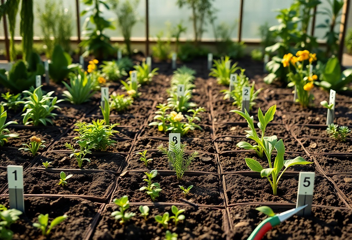
Many users are discovering the benefits of implementing a Data Garden Visualization Theme at Lovable.dev, enhancing their data representation and interaction. By following these five organic steps, you can effectively cultivate a dynamic and visually appealing data garden that not only showcases your information but also engages your audience. Ensure you prioritize your goals and utilize the right tools to avoid pitfalls and maximize the positive impact of your data visualizations.
Key Takeaways:
- Identify core themes that align with user interests.
- Utilize intuitive design principles for better user engagement.
- Incorporate feedback loops for continuous improvement.
- Encourage collaborative contributions from the community.
- Leverage analytics to track growth and optimize content.
Understanding Data Garden Visualization
This approach relies on creating a structured, user-centered environment where data can thrive. By merging aesthetics with analytics, you foster a unique space that enhances user engagement and encourages exploration, ultimately leading to actionable insights drawn from complex information sets.
Definition and Importance
Data Garden Visualization combines creative design with systematic data representation to cultivate user interaction. This method not only makes data accessible and understandable but also emphasizes its relevance through engaging visuals. With the rise of big data, your ability to effectively visualize information can transform how users interpret and act on insights.
Key Components of Data Gardening
Key components of Data Gardening include user-centric design, interactive elements, scalability, and adaptive analytics. You should prioritize these features to ensure that your visualizations resonate with your audience, allowing for a more personalized experience. Additionally, integrating real-time data feeds enhances the dynamism of your visualizations, making them more relevant and engaging.
Scalability is particularly significant as it determines how well your visualizations can grow alongside increasing data volumes. For instance, incorporating modular design elements allows you to swiftly adapt and expand upon the existing structure without compromising user experience. Interactive components, such as hover effects and drill-down capabilities, further enrich the experience, giving users the power to explore data layers that are most pertinent to them. By focusing on these key aspects, you encourage users to not only consume data passively but to interact with it meaningfully, leading to a deeper understanding and appreciation of the information presented.
Step 1: Soil Preparation
In data visualization, the foundation is everything. Start by ensuring your data is free from inconsistencies and irrelevant information, similar to preparing soil for planting. The initial stage involves collecting all relevant data sets, followed by a rigorous process to filter out noise that can distort your final visualizations. Investing time in this preparation stage pays off significantly in the later phases of your project, enabling a clearer picture of the insights your data holds.
Data Cleaning Techniques
Employ a variety of data cleaning techniques to enhance the usability of your datasets. Techniques such as removing duplicates, handling missing values, and converting data types are vital. Tools like Python’s Pandas library or R’s dplyr package can automate these tasks effectively. For instance, using the ‘dropna()’ function in Pandas efficiently removes rows with missing data, ensuring you work with a cleaner dataset.
Ensuring Data Quality
Data quality directly influences the reliability of your visualizations. Ensure accuracy by cross-verifying data points against trusted sources, which helps build a robust framework for your analysis. This includes validating data entries through automated checks and peer review processes to uncover errors early on. Utilize software tools that flag anomalies to effectively maintain high-quality standards.
To achieve impeccable data quality, you can adopt a strategy that includes setting up regular audits of your datasets, maintaining clear documentation, and using version control. For example, implementing a schema validation process ensures conformity to established standards. Additionally, consider engaging your team in quality checks during the data collection phase, which fosters a culture of accountability and attention to detail, ultimately yielding more precise and insightful visualizations.
Step 2: Choosing the Right Tools
Your choice of tools can make or break your data garden visualization theme. Selecting intuitive yet powerful tools is imperative for effectively communicating your data. Focus on software that offers user-friendly interfaces and robust functionality. Look for options that support various data formats and allow for customization to meet your specific needs. Consider your team’s skill set and ensure the tools you choose can be seamlessly integrated into your existing workflow.
Visualization Software Options
Explore popular visualization software such as Tableau, Power BI, or D3.js, which each provide unique features. For instance, Tableau caters to those seeking interactive dashboards, while D3.js offers extensive customization for developers. Assess your specific objectives and the level of interactivity you wish to achieve to identify the best fit. Knowing your audience will guide you in selecting a tool that presents data in a comprehensible format.
Integration with Lovable.dev
Integrating visualization tools with Lovable.dev enhances your data presentation significantly. Effortlessly connect your chosen software with Lovable.dev to create cohesive workflows that simplify data management and visualization processes. This integration streamlines accessibility, allowing you to leverage Lovable.dev’s capabilities while utilizing other leading visualization tools to produce comprehensive, engaging data displays.
By integrating visualization tools with Lovable.dev, you can harness the platform’s robust features for data organization and user engagement. For example, using API connections or webhooks can automate data imports, minimizing manual work and ensuring real-time visualization updates. This synergy allows you to maintain consistency across your data garden while capitalizing on Lovable.dev’s strengths, ultimately leading to a more effective presentation of insights. These integrations not only increase the efficiency of your processes but also enhance collaborative efforts within your team, making it easier to share insights and drive decisions based on the most current data.

Step 3: Planting the Seeds
It’s time to sow the seeds of your data garden. Start by conceptualizing your visualizations, ensuring they reflect your objectives. Explore Build Ai-powered Data Analysis & Visualization Projects … to inspire your designs. Your visualizations should engage, inform, and provoke curiosity while being user-friendly.
Designing Initial Visualizations
Your initial visualizations should serve as the backbone of your project. Focus on clarity and storytelling. Utilize charts, graphs, and heatmaps effectively to convey insights while avoiding clutter. A well-designed layout enhances the user’s understanding and interaction with the data.
Experimenting with Data Types
Experimenting with various data types is important. By analyzing quantitative and qualitative data formats, you can uncover unique patterns. This exploration fosters innovation and enriches your final visualizations. Recognizing the interrelationships among diverse data types will empower your project further.
| Data Types | Examples |
| Quantitative | Sales figures, Temperature readings |
| Qualitative | Feedback ratings, User comments |
| Time Series | Stock prices over time |
| Categorical | Product types, Age groups |
Engaging with a variety of data types will enrich your visual storytelling. You might find patterns or correlations that would otherwise go unnoticed. For instance, integrating regional sales data with customer feedback can uncover insights about market preferences. Recognizing these connections can significantly enhance your analysis.
- Engagement is key.
- Patterns emerge through exploration.
- Understanding varies by data type.
- Clarity drives comprehension.
- Recognizing these principles will enhance your approach.
| Data Analysis Techniques | Benefits |
| Correlation Analysis | Identifies relationships between variables |
| Trend Analysis | Reveals patterns over time |
| Cluster Analysis | Groups similar data points for insights |
| A/B Testing | Compares two strategies for effectiveness |
Step 4: Nurturing Growth
As your data garden blooms, nurturing its growth becomes necessary for ongoing success. This involves continuous engagement with your visualizations and ensuring they evolve with your audience’s needs. Regularly revisiting your themes not only keeps them fresh but also enhances their relevance and appeal. Just as a gardener tends to their plants, you must cultivate your data garden to foster a thriving ecosystem that captivates and informs.
Regular Updates and Refinement
Consistency in updating your visualizations ensures that they reflect the latest data and trends. By routinely refining your visual elements and narratives, you enhance clarity and aesthetics. Utilize analytics to identify areas needing improvement; for example, if a particular visualization sees high engagement, consider expanding on that theme to deepen insights.
Gathering User Feedback
Your users are invaluable sources of insight; their feedback can illuminate what strategies are working and what needs adjustment. Implement surveys or feedback forms after users interact with your visualizations, asking targeted questions about clarity, engagement, and content relevance. This direct line to your audience will provide necessary data to inform your growth strategies.
Consider offering incentives, such as exclusive content or features, to encourage more extensive feedback. An effective feedback loop allows you to pinpoint specific elements your users appreciate or struggle with, enabling you to make targeted improvements. For instance, if users express confusion over a particular visualization, you can refine it for better clarity. Creating a community around your data garden also fosters ongoing dialogue, paving the way for consistent enhancements tailored to your audience’s preferences.
Step 5: Harvesting Insights
At this stage, you begin to harvest the fruits of your labor by extracting actionable insights from your data garden. Focus on analyzing trends, identifying patterns, and assessing how effectively your visualizations meet their objectives. This step is necessary for recognizing what works, what doesn’t, and how to refine your approach moving forward.
Analyzing Data Outcomes
Once data visualization projects are complete, it’s time to dive deep into the outcomes. By employing analytical tools, you can measure performance against key metrics, uncovering areas of success or those in need of improvement. This reflection helps inform future projects and ensures your visualizations continually evolve based on solid evidence.
Sharing Results with the Community
Communicating your findings with the broader community of data enthusiasts amplifies the impact of your work. Sharing insights helps foster a collective knowledge environment, making it easier to adopt best practices and innovative ideas. Engaging with peers not only provides feedback but also cultivates a collaborative spirit that drives further exploration.
Utilize platforms such as blogs, forums, and social media to showcase your results. Create engaging content that highlights key findings, compelling visuals, and actionable recommendations. For instance, consider hosting a webinar or contributing to data-focused meetups where you can present your insights. This not only positions you as a thought leader but also invites diverse perspectives that can enhance your future projects. Building a community around your findings will foster an enriching dialogue and encourage continued growth in your data garden endeavors.
Conclusion
So, by following these 5 organic steps to cultivate a data garden visualization theme at Lovable.dev, you can enhance the impact and accessibility of your data presentations. Embracing these strategies allows you to engage your audience more effectively, making your insights not only visually appealing but also easier to comprehend. As you implement these techniques, you’ll foster a deeper connection between your data and your viewers, ultimately empowering them to draw meaningful conclusions from your work.
FAQ
Q: What is the purpose of the 5 Organic Steps To Grow A Data Garden Visualization Theme at Lovable.dev?
A: The purpose is to provide a structured approach for users to enhance their data visualization capabilities, fostering better understanding and insight through organic growth techniques.
Q: What are the first steps to initiate the data garden visualization theme?
A: The initial steps involve defining your data goals, selecting relevant datasets, and ensuring data quality to create a solid foundation for visualization.
Q: How can I ensure that my visualizations are engaging and effectively communicate data?
A: Use storytelling techniques, choose appropriate visualization formats, and maintain consistency in design elements to create engaging and clear visual narratives.
Q: What tools or resources are recommended for implementing the data garden visualization theme?
A: Recommended tools include data visualization software like Tableau or D3.js, as well as online resources for design inspiration and best practices.
Q: How can I assess the impact of my data garden visualizations over time?
A: Track user engagement metrics, gather feedback, and analyze how visualizations influence decision-making to assess their impact and refine your approach.


0 Comments